Behind the Brand: British Heritage, Pink Confidence and a Modern Vision
More Than a Bottle
Every memorable brand begins with an idea about how people should feel. For Lady Charlotte Pink Gin, that idea is a particular blend of confidence, British elegance and enjoyment. The bottle may be pink, but the ambition behind the design is broader: to make a familiar British spirit feel fresh, celebratory and unmistakably individual.
The brand brings together a classic London Dry identity, a distinctive botanical story and a visual world of pink, turquoise and gold. Those elements work because they speak to the same personality. Lady Charlotte is polished without being distant, expressive without being careless and playful without forgetting the traditions that inspired it.
Behind the Brand is therefore not only a story about gin production. It is about the decisions that give a product its character: where it comes from, how it is presented, what it stands for and how it might become part of someone’s life. Those details are the foundation of a recognisable brand.
The Founder’s Vision
Lady Charlotte is the founder and creative force behind the brand. Her approach draws on an interest in luxury presentation, hospitality and storytelling, as well as the belief that a British gin can have a distinctive personality of its own. Rather than treating packaging and experience as afterthoughts, she places them alongside the product’s identity.
A founder-led brand often carries a clearer sense of taste because the choices are personal. The palette, the bottle silhouette, the phrases and the imagined occasions all need to feel part of one world. That does not mean every customer must share the founder’s style. It means there is a consistent starting point from which customers can make the experience their own.
Lady Charlotte’s vision is one of accessible ceremony: the pleasure of a beautiful drink without the stiffness that can sometimes accompany luxury. The brand can sit at a formal dinner, but it should also feel welcome at a lively gathering with friends. That balance is central to its character.
British Heritage as Inspiration
British heritage is woven into the brand’s language, from the words London Dry to the images of countryside entertaining, garden parties and carefully prepared cocktails. It is an appreciation of continuity rather than an attempt to recreate the past. The most enduring traditions survive because people find new ways to enjoy them.
Gin has a long association with British drinking culture, but Lady Charlotte approaches that familiarity with a different visual energy. The pink bottle offers an immediate contrast to more restrained spirits packaging, while the classical gin designation keeps the product grounded in a recognisable category. Old and new are allowed to share the same table.
This relationship between tradition and contemporary style is what makes the brand’s heritage language meaningful. It is not merely a collection of historical references. It is a design principle: take the rituals worth keeping, add a little confidence and make the experience relevant to today.
Made in Hertfordshire
Lady Charlotte Pink Gin is described as distilled in Hertfordshire, England, in a setting associated with historic English countryside. The location matters to the brand story because it connects the spirit to a landscape of estates, gardens and British social tradition. It gives the product a sense of place beyond its name.
The brand associates its production story with Luton Hoo and the area’s historical character. Such heritage is best approached with care: the significance of a place can inspire a brand without implying that historic figures endorsed or encountered a modern product. What matters to the customer is the genuine connection between place, production and present-day identity.
A sense of place can be felt in the details of storytelling: the colours of a garden, the atmosphere of a country-house gathering and the familiar ritual of a cold gin and tonic. Those references help explain why the brand looks and sounds the way it does. They are an invitation into a mood, not a substitute for the drink itself.
Why Pink?
Pink is the most immediate visual decision in the Lady Charlotte identity, and it is used with intention. The colour can be romantic, joyful, theatrical or sharply modern depending on its setting. Rather than treating pink as a narrow category, the brand presents it as an expression of confidence and pleasure.
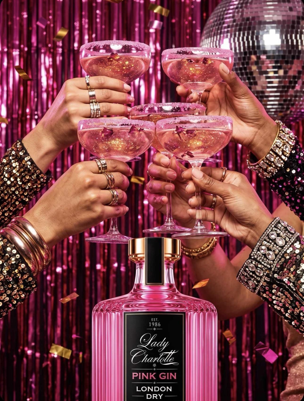
The bright bottle is complemented by turquoise and gold, a combination that feels lively but polished. Black Label adds a more dramatic contrast for evening occasions. Across the collection, the palette creates instant recognition while leaving room for different moods. A picnic and a Martini bar can look different yet still feel unmistakably Lady Charlotte.
Colour is also a powerful storytelling tool because it reaches people before a sentence is read. Someone may notice the bottle on a shelf or in a photograph, then become curious about the spirit behind it. The aim is to reward that curiosity with a coherent product and experience.
The Signature Ingredients
Pear, mulberry and hibiscus form the brand’s recognisable botanical story. Pear evokes the freshness of an orchard, mulberry brings an association of deeper fruit notes and hibiscus is linked to the gin’s pink colour. Together, they give the brand a flavour vocabulary that is distinctive without losing the underlying London Dry identity.
These ingredients also translate naturally into visual storytelling. A carefully chosen garnish, a botanical illustration or a restrained cocktail photograph can communicate the product’s character without needing long explanations. Yet the best way to understand any spirit remains to try it in a simple, well-prepared serve.
The brand’s challenge is to keep the liquid and the image in conversation. A memorable bottle may earn a first glance, but a thoughtful drink is what makes the story more than packaging. Lady Charlotte’s ingredient-led identity is intended to provide that connection between appearance and experience.
The Bottle as an Object
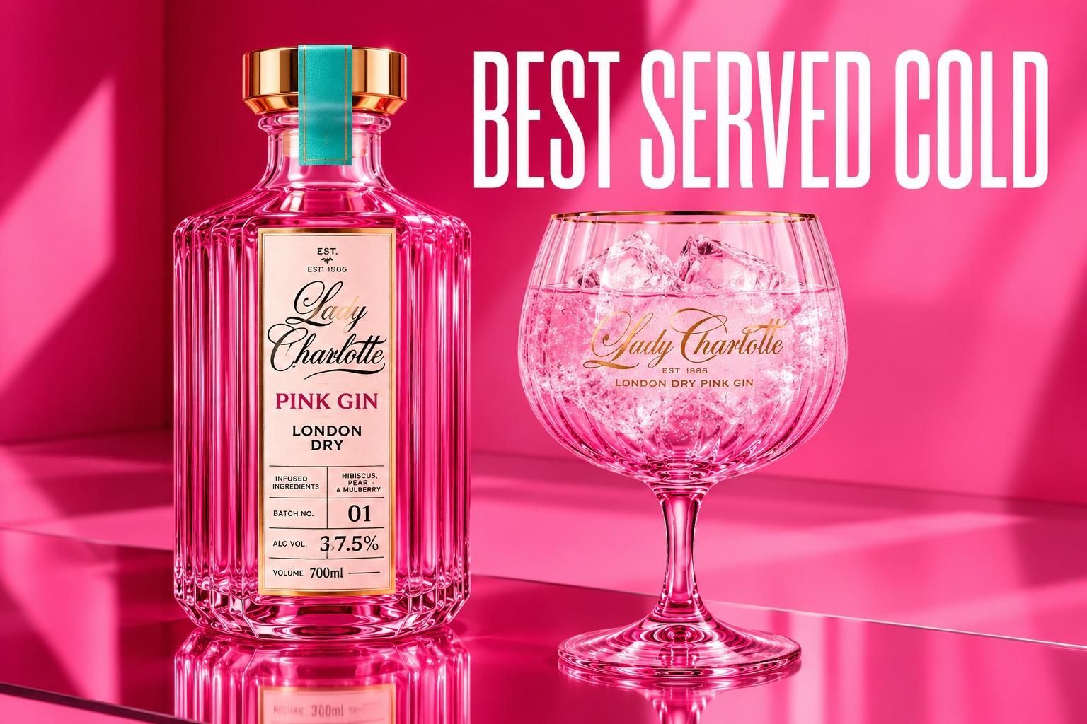
Lady Charlotte’s bottle is designed to be noticed. Its pink appearance, structured shape, gold cap and decorative details create a sense of occasion even before the first drink is poured. It is an example of packaging acting as part of the experience rather than merely a container.
For a luxury-leaning brand, these decisions have practical consequences. A recognisable silhouette helps customers identify the product; consistent labelling distinguishes the classic expression from Black Label; and strong photography gives the design a life online. The bottle needs to look coherent in a shop, on a dining table and in a close-up image.
There is also a simple pleasure in placing a beautiful object on a bar trolley or giving it as a present. The bottle should never overshadow the spirit, but it can make the act of choosing and serving it feel more special. That is the role of good design: to make an experience easier to recognise and enjoy.
Classic and Black Label
The collection begins with two clear expressions. The classic Lady Charlotte Pink Gin is bottled at 37.5% ABV, while Black Label is bottled at 43% ABV. Both belong to the same visual and botanical world, but they offer different points of entry for different preferences and occasions.
The classic expression naturally suggests a chilled gin and tonic, an easy cocktail or a sunny gathering. Black Label brings a more formal mood, particularly around the Martini and evening entertaining. These are suggested rituals rather than strict rules. A person’s favourite serve is ultimately the one that suits their palate.
Together, the two bottles help tell a more complete brand story. Lady Charlotte can be relaxed or dressed up, colourful or dramatic, familiar or unexpected. The consistency comes from the identity beneath those moods: British gin, distinctive presentation and attention to the experience of serving.
Best Served Cold: A Philosophy
The words Best Served Cold are a useful expression of the brand’s attention to detail. They describe a practical approach to gin service while also suggesting a wider attitude: do the simple things properly. A chilled glass, fresh ice and a suitable mixer can make a remarkable difference to the pleasure of a drink.
That approach extends beyond the bar. A carefully set table, a thoughtfully chosen gift and a well-planned gathering all communicate the same sense of care. None requires extravagance. The luxury is in the feeling that the moment has been considered and that guests can relax into it.
A strong brand phrase should work in more than one setting. Best Served Cold can appear beside a gin and tonic, accompany a Martini photograph or become part of a summer campaign. Its clarity makes it memorable, while the practical truth of chilling a drink gives it substance.
The Ultimate Pink Drink
The Ultimate Pink Drink is the brand’s signature expression of confidence. It is a phrase designed to be remembered, shared and enjoyed with a smile. Its strength lies in being simple enough to suit a bottle, a cocktail menu or a conversation between friends.
The words also leave room for interpretation. For one person, the ultimate pink drink is a gin and tonic with plenty of ice. For another, it is a Martini before dinner. For someone else, it is the glass raised at a celebration. The brand supplies the character; the customer supplies the memory.
That openness is important. Lady Charlotte is visually distinctive, but it is not intended to prescribe a single way to socialise or entertain. The invitation is to make an occasion feel more personal, more colourful and a little more special, without losing sight of the people sharing it.
A Lifestyle Beyond the Glass
The Lady Charlotte aesthetic naturally extends into the world of entertaining: glassware, cocktail accessories, picnic baskets, blankets, deck chairs and other objects associated with gathering people together. These products make sense as part of the brand because they support the occasions in which the gin might be enjoyed.
A picnic basket suggests an afternoon outdoors; elegant glasses suggest a toast; a shaker suggests the pleasure of making a cocktail at home. The common thread is not simply putting a logo on an object. It is creating a coherent atmosphere of British leisure, colour and hospitality.
The best lifestyle collections are useful as well as beautiful. They should feel at home in everyday life, not only in a photograph. For Lady Charlotte, that means combining playful design with a practical appreciation of how people host, travel, give gifts and spend time together.
The British Summer Imagination
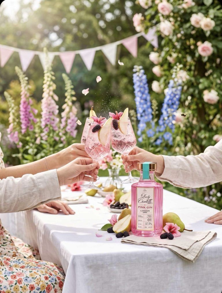
The brand’s visual world has a natural affinity with the British summer. Think of a garden table with linen, a striped deck chair, a wicker basket and a cold drink ready for guests. The atmosphere is optimistic and familiar, even when the weather refuses to cooperate.
Lady Charlotte’s colours work especially well in this setting because they bring energy without needing a complicated backdrop. Pink and turquoise can be bold beside a green lawn, while gold details lend a more polished finish. The result is a sense of occasion that can be achieved with just a few thoughtful elements.
But the summer story is not a seasonal limit. The same brand can move into autumn dinner parties, Christmas gifting and winter celebrations. What travels between these occasions is the underlying idea of hospitality: creating space for people to enjoy each other’s company.
A Brand for Different People
Lady Charlotte’s pink identity is confident, but it is not intended to belong to only one kind of person. Style and taste are individual, and colour does not determine who can enjoy a drink. The brand’s playful femininity is part of its visual character, not a boundary around its audience.
A memorable gin can appeal to people who love design, people who love cocktails and people who simply appreciate a well-made cold serve. Some may be drawn first to the bottle, others to the London Dry designation or the ingredients. A strong brand makes room for those different entry points.
That breadth is best expressed through inclusive hospitality. Offer guests choices, prepare non-alcoholic drinks with equal care and let everyone decide what suits them. The purpose of a gathering is connection, and the most attractive style is one that makes people feel welcome.
The Art of Telling a Brand Story
A good brand story should be recognisable across different places: a website, a bottle label, a photograph, a gift box and a cocktail menu. For Lady Charlotte, the recurring elements are British heritage, pink confidence, botanical character and the ritual of serving cold. Each piece should reinforce the others.
Consistency does not require repetition of the same sentence everywhere. A product page can explain ingredients and bottle size; an editorial article can explore the inspiration; a cocktail page can give practical serving guidance. Together, these formats allow customers to discover the brand gradually, at their own pace.
The most convincing stories also distinguish inspiration from fact. Heritage references should be accurate, production details should be clear and promises about the drink should be grounded. Confidence is strongest when it does not need exaggeration. Lady Charlotte’s aesthetic is expressive enough to stand on its own.
The Next Chapter
Lady Charlotte Pink Gin is a founder-led expression of a simple idea: British gin can honour its traditions while looking and feeling unmistakably contemporary. From its Hertfordshire story to its pink bottle, from the classic expression to Black Label, the brand is designed around recognisable choices rather than passing novelty.
The future of any brand is shaped by the occasions in which people choose to make it part of their lives. A gift opened, a cocktail mixed, a table set and a photograph remembered all contribute to that story. They are small moments, but they give an identity meaning beyond its label.
For anyone encountering Lady Charlotte for the first time, the invitation is straightforward. Discover the ingredients, choose the expression that suits you and prepare a drink with care. British heritage, modern colour and a touch of glamour meet in one familiar instruction: Best Served Cold.
A Final Thought
Behind every visual decision is the question of how a customer will encounter the brand. Someone might first see a photograph, then read about the botanicals, then choose a bottle for a celebration. Each encounter should offer a consistent impression while adding something useful. That is why the Lady Charlotte story is best told through both editorial inspiration and practical information: the history of the idea, the character of the product and the simple pleasure of preparing it well. The story also belongs to the people who make these occasions their own. From a quiet supper to a cheerful garden gathering, the strongest expression of the brand is not a slogan alone but a thoughtful experience that feels welcoming, distinctive and easy to remember.
Please enjoy responsibly. For adults aged 18 and over.